Motorsport Dashboards — Reading Races Through Data

Interactive race dashboards for the great 24-hour races: lap times, tire stints, pit stops, position changes, and the safety-car effect — read the race, don't just follow it.

A race report tells you what happened. A dashboard shows you why. Lap times, tire stints, pit stops, position changes, and the effect of every safety-car phase — the metrics race engineers use to read a 24-hour race, all in one place and ready to explore for yourself.

We’re starting with Le Mans — the strongest endurance race on the international calendar. Nürburgring, Daytona, and a WEC season dashboard will follow. Every dashboard is built from the same data as the Race Intelligence analyses; nothing is invented by hand, everything is reproducible.
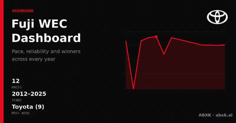
  • 2.2 Le Mans 24h Dashboard — Stints, Pit Stops, Position Changes, Safety-Car Effect
  • 2.3 Nürburgring 24h Dashboard
  • 2.3 Daytona 24h Dashboard
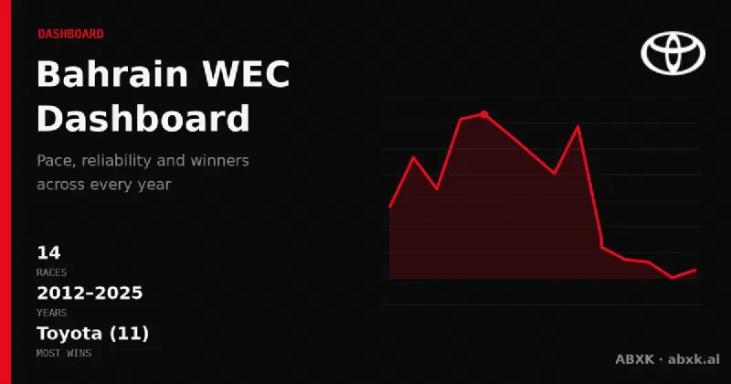
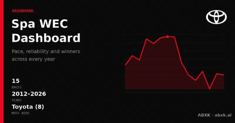
  • 2.3 WEC Season Dashboard
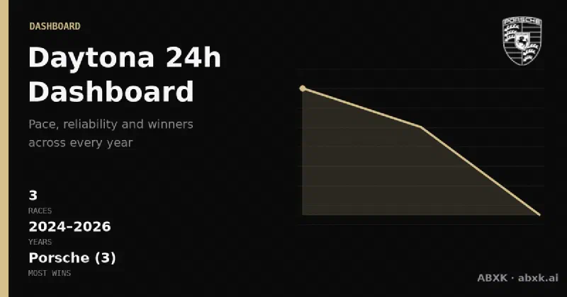
The Daytona dashboard from ABXK: overall winners, manufacturer record, pace and reliability trends of the GTP era across multiple editions — directly comparable, derived from real race data of the Rolex 24.

Daytona 24h Dashboard

The Daytona dashboard from ABXK: overall winners, manufacturer record, pace and reliability trends of the GTP era across multiple editions — directly comparable, derived from real race data of the Rolex 24.

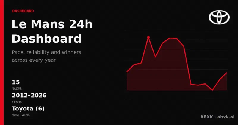
The Le Mans dashboard from ABXK: overall winners, manufacturer record, pace and reliability trends of the Hypercar era across multiple years — directly comparable, derived from real race data.

Le Mans 24h Dashboard

The Le Mans dashboard from ABXK: overall winners, manufacturer record, pace and reliability trends of the Hypercar era across multiple years — directly comparable, derived from real race data.