

In many companies, someone spends hours every week copying numbers from different tools into a spreadsheet, just to build the same report again. AI-powered analytics tools can take over much of this work. They pull the data from your systems, update dashboards automatically, write short summaries, answer questions in plain language and warn you when a number looks unusual. There is one catch: a dashboard with wrong numbers is worse than no dashboard, because people make decisions based on it.
This is part 5 of Level 1, the last part of this level in our AI Work learning path. The earlier parts showed AI in sales, customer service, marketing and e-commerce; this one looks at the numbers they all produce. You will learn the steps from data to decision, how to define metrics so that everyone means the same thing, how to ask questions of your data, how anomaly alerts work and how to check a number before it counts.
From data to decision
Every dashboard rests on the same five steps. A dashboard is a page with your most important numbers, updated automatically. A report is a regular summary, such as a weekly email, often with a short comment on what changed. The numbers in both are your KPIs (key performance indicators): the few metrics that show whether you reach your goals.
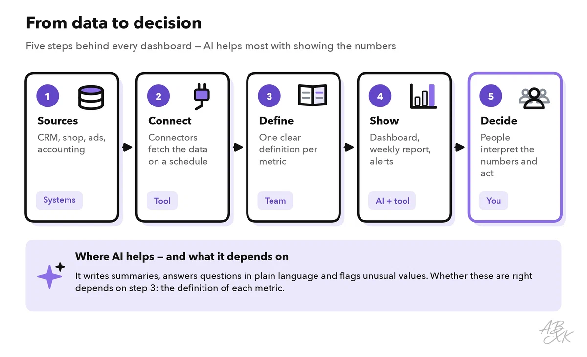
The connectors in step 2 are ready-made links between the analytics tool and your other systems, such as your CRM, your online store, your ad accounts or your accounting software. They fetch new data on a schedule, so nobody has to copy numbers by hand. AI features then do three jobs: they write summaries (“Revenue rose 6% this week, mainly from returning customers”), they answer questions, and they flag unusual values.
Before you connect anything, write down which decisions the dashboard should support: “Do we reorder this product?”, “Which campaign gets more budget?”, “Do we need more staff in the service team?” Each KPI should belong to at least one such decision. A dashboard with 40 numbers looks impressive, but people stop reading it after a week.
Define your metrics before you automate
Many wrong reports are not caused by the AI. They come from unclear definitions. Does “revenue” include sales tax? Are refunds subtracted? Does a sale count on the order date or the payment date? Is an “active customer” someone who bought in the last 30 days or in the last 90? If two teams answer these questions differently, their dashboards will never match — and an AI that answers questions about “revenue” has to guess.
Write a short definition for every KPI before you build the dashboard:
| Field | Example: net revenue |
|---|---|
| Question it answers | How much did we really earn from sales? |
| Formula | Order value minus refunds, without sales tax and shipping |
| Source | Shop database: orders and refunds |
| Time | By order date, in your company’s time zone |
| Filters | Without test orders and internal accounts |
| Owner | Finance team |
Store these definitions where the tool can use them. Many analytics tools have a field for metric descriptions; in others, you can add them to the instructions for the AI. Good data matters as much as good definitions; Level 0 explains why AI needs good business data.
Ask your data questions in plain language
Many analytics tools now let you type a question such as “How did net revenue in Q3 compare with Q2?” The tool translates the question into a database query — often in SQL (Structured Query Language, the standard language for asking databases) — runs it and shows the answer, often as a chart. This is called a natural-language query.
It saves time, but it can go wrong in quiet ways. The tool might pick the wrong table, use a different definition of “revenue”, forget a filter or count today’s incomplete data. So ask for the assumptions and the calculation, as in this example:
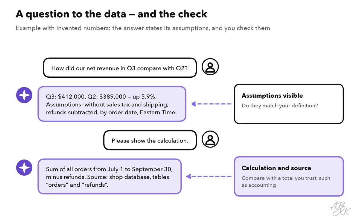
Good questions name the metric, the period and the comparison, for example “net revenue, Q3 compared with Q2, by order date”. Vague questions such as “How are we doing?” get vague answers, or answers built on assumptions you never see.
Alerts for unusual values
Nobody looks at every dashboard every day. Anomaly alerts do that for you. The tool learns the usual pattern of a metric, including weekdays and seasons, and sends a message when a value leaves the expected range. In the example, orders on day 23 fall far below that range. The team checks and finds an error in the checkout after an update.
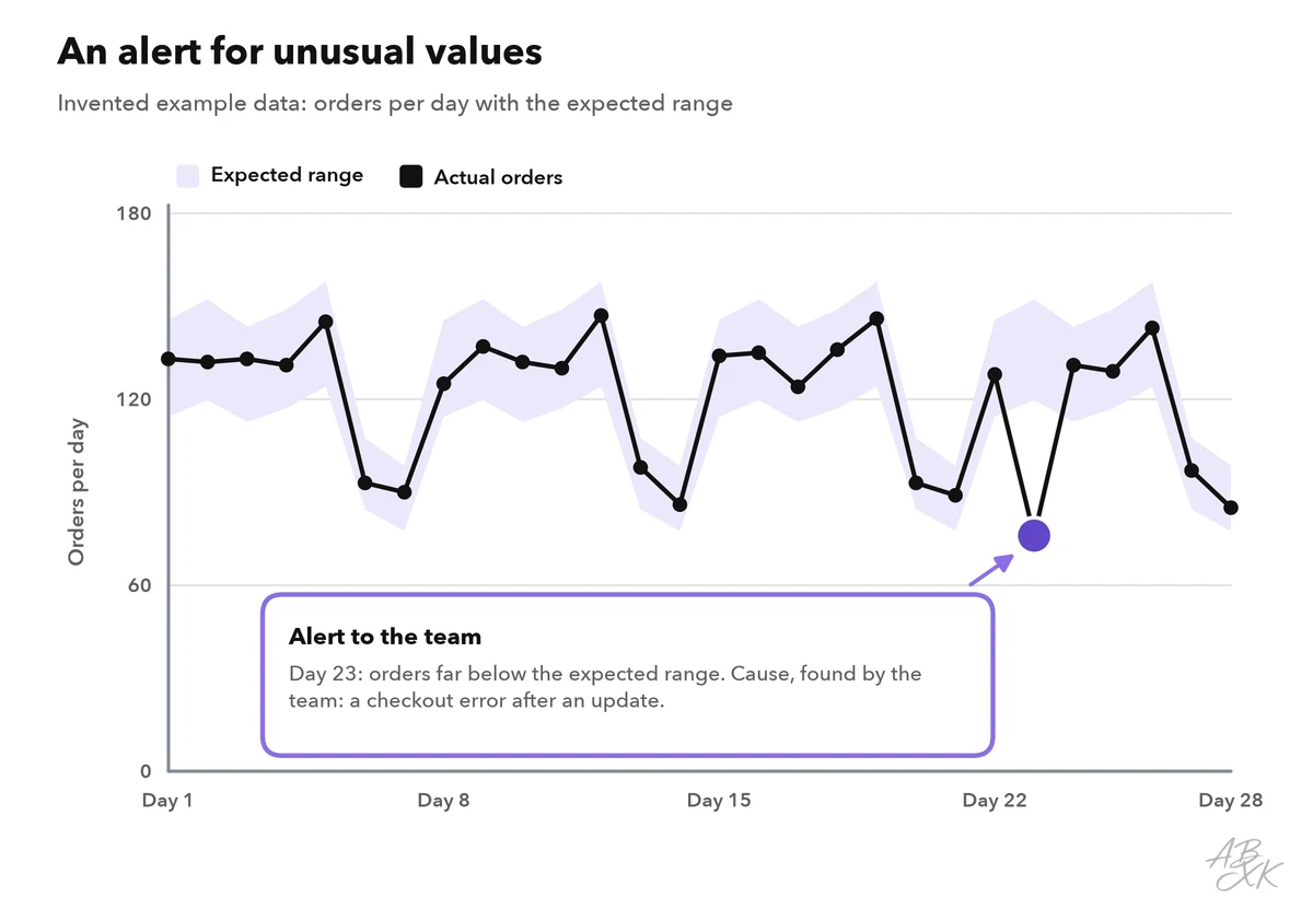
Two rules make alerts useful. First, start with a few important metrics: too many alerts teach people to ignore them. Second, decide in advance who receives which alert and what that person does next. After a month, review the alert rules: which alerts led to action, and which were only noise? Level 2 shows how alerts like these can start automated business workflows with approvals.
Tools for reports and dashboards
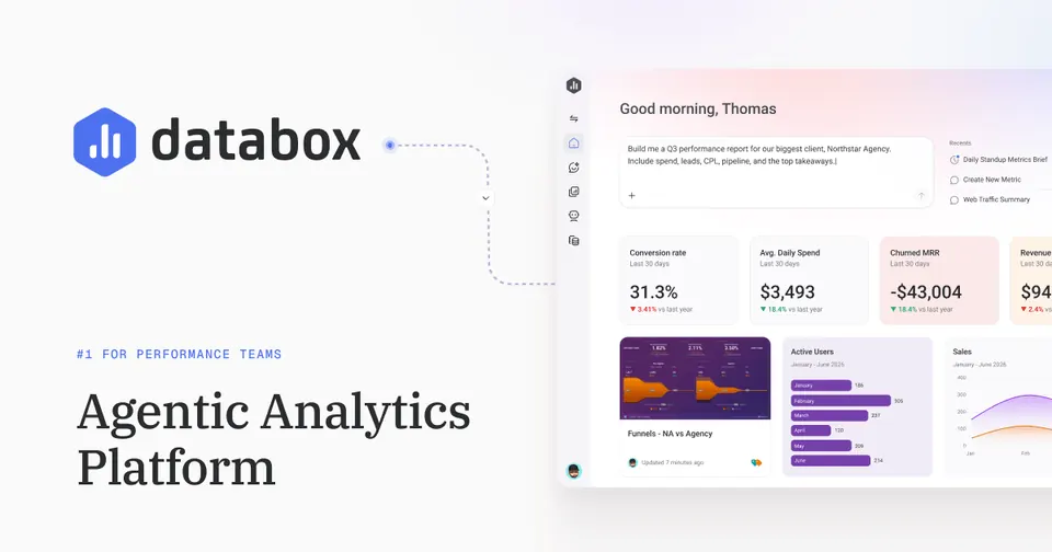
Our comparison lists 8 tools in Analytics & Operations, and some reporting tools for one department sit in other areas. According to the vendors, Databox connects data sources and builds dashboards, reports and goals with AI analysis. Snowfire AI combines company data with external signals for leadership teams. DataHawk brings marketplace data into dashboards with daily alerts, and Motion turns ad results into visual reports on which creatives work.




Short descriptions from our tool comparison, based on the vendors' information — not tested by ABXK.
Check a number before it counts
Before a number goes into a report for your management or your customers, run these checks. They take a few minutes and catch the most common errors:
| Check | How to do it | A typical problem it catches |
|---|---|---|
| Known total | Compare with a number you trust, such as accounting or the back end of your shop | The dashboard includes sales tax |
| Period and time zone | Check the start, the end and the time zone | Orders after midnight land on the wrong day |
| Filters | Check which records are in and which are out | Test orders and internal accounts are counted |
| Units and currency | Check net or gross, and the currency | Euros and dollars are added together |
| Completeness | Check when the data was last updated | Today looks like a drop because the sync runs at night |
| Single records | Open three to five records behind the number | A customer is counted twice |
These checks also give you numbers you can trust as a starting point — the baseline that Level 3 uses to judge an AI pilot project.