

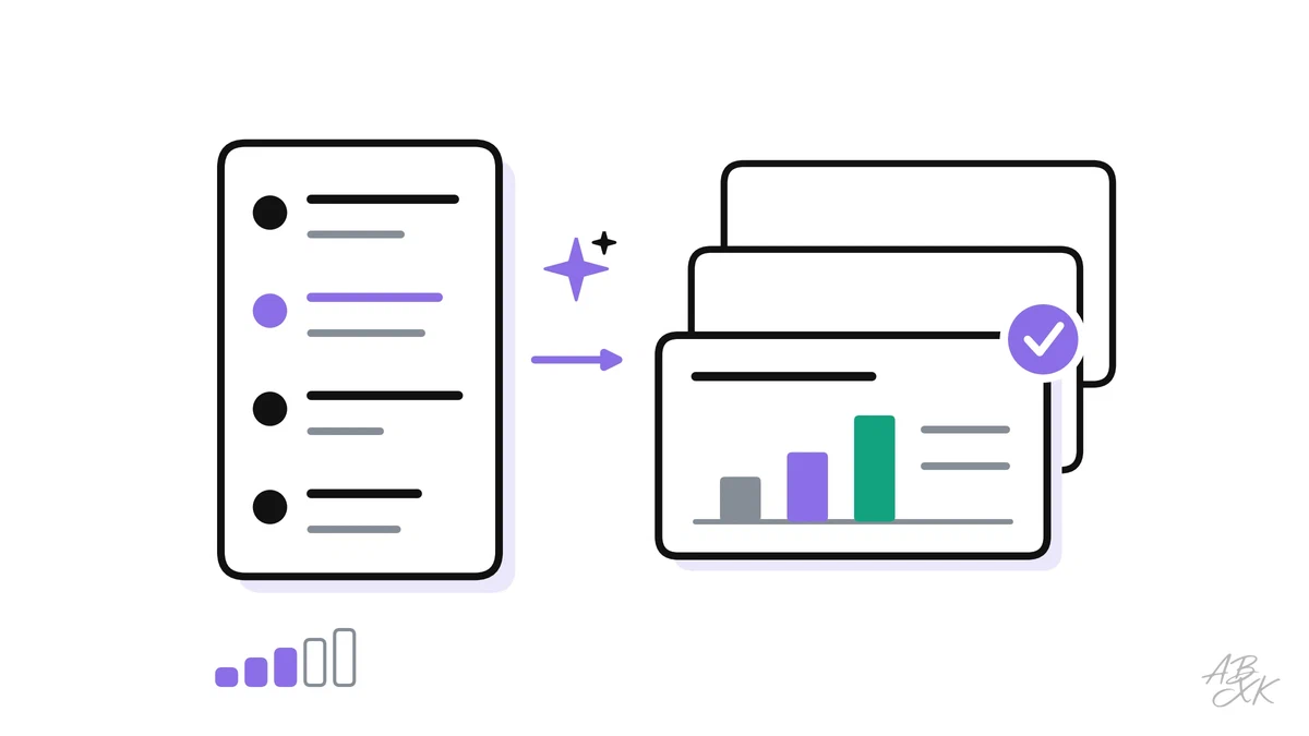
AI presentation tools can turn a one-line topic into a complete deck, a set of slides with layouts, pictures and charts, in a few minutes. The result looks finished. Often it is not: the slide titles say little, the charts show numbers nobody checked, and the deck has no clear message. A better tool rarely fixes this. A better order of work does.
This is part 2 of Level 2 in our AI Productivity learning path. Level 2 is about workflows and quality control. Here you learn a five-step workflow: set the message, ask for an outline, generate the slides, fix design and data, and finish with speaker notes and an accessibility check. It builds on the four building blocks of a prompt from Level 1.
Start with the story, not the slides
Many weak AI decks begin with the wrong question: “Which tool makes the nicest slides?” A better first question is: “What should the audience know and do after my talk?” In the workflow below, the tool only comes in at step 3.
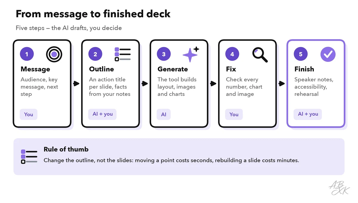
Before you open any tool, write down three things:
- Audience: Who will be in the room? What do they already know, and what do they care about?
- Key message: The key message is the one sentence the audience should remember, even if they forget everything else. For example: “With the new onboarding, new hires work on their own sooner, so we want to use it in all teams.”
- Next step: What should happen after the talk? A decision, an approval or a change in how people work.
If you cannot write your key message in one sentence, no tool can write it for you. An AI assistant can still help you sharpen it. Ask it to play your audience: “Play a skeptical head of finance. Ask me five tough questions about this proposal.” Your answers often belong in the deck. Part 1 of this level explains this and other prompt patterns that work.
Ask for an outline before you ask for slides
Many tools offer to build slides straight from a topic. Ask for an outline first: a list of slides, each with a title and a few key points. An outline is quick to change. You can move, merge or delete a point in seconds. Reworking finished slides takes much longer.
A good outline prompt has five parts:
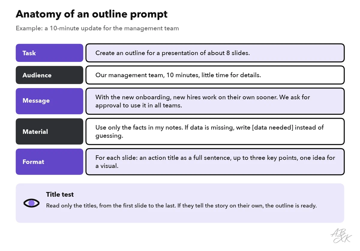
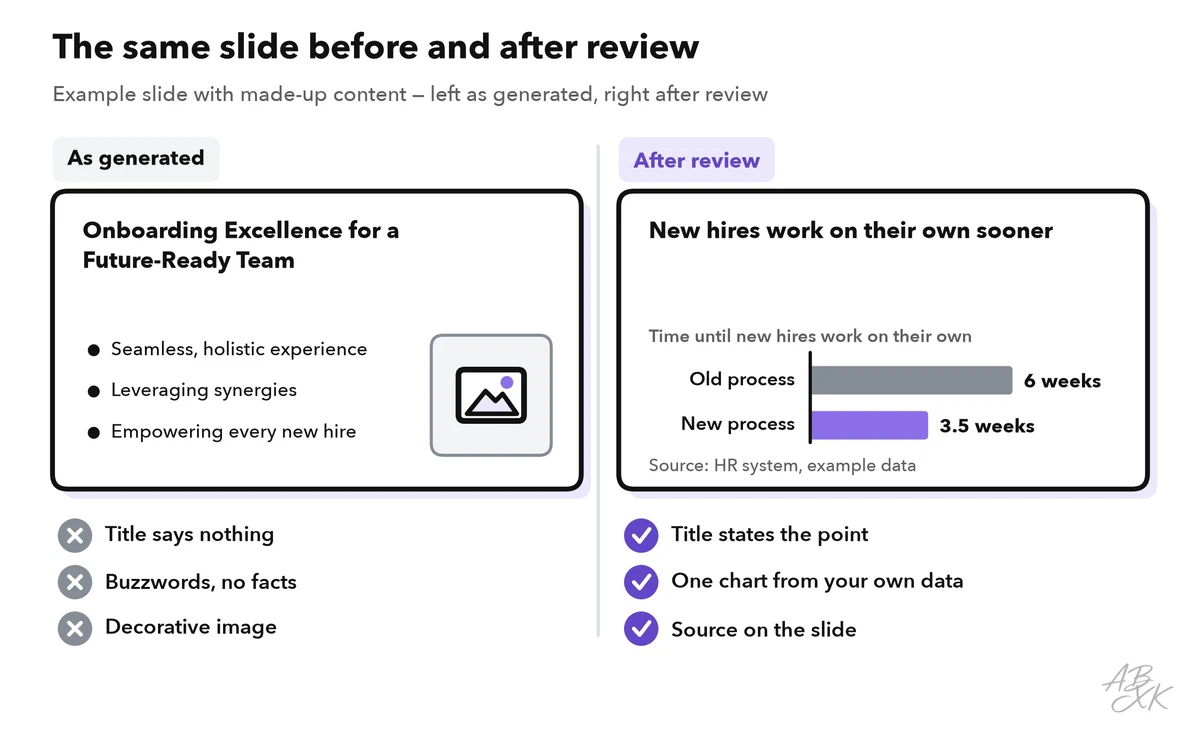
Two parts matter most. The material rule tells the AI to use only your facts and to mark gaps, so it does not fill them with invented numbers. The format asks for action titles. An action title is a slide title written as a full sentence that states the main point of the slide: “New hires work on their own sooner” instead of “Onboarding results”.
Action titles make a quick quality check possible, the title test: read only the titles, from the first slide to the last. If they tell your story on their own, the outline works. If they do not, fix the outline now, while changes are still cheap.
Generate the slides from your outline
Once the outline works, turn it into slides. There are two common routes.
Route 1: a presentation maker. You paste the outline into a dedicated tool, and it chooses layouts, pictures and colors. Our comparison lists 3 tools in the area Presentations & Design. According to the vendors, Gamma creates presentations, web pages and social graphics from a text prompt. Beautiful.ai designs slides automatically and keeps decks on brand. Prezi offers a zoomable canvas with AI help for creation, plus live polls and quizzes.



Short descriptions from our tool comparison, based on the vendors' information — not tested by ABXK.
Route 2: a chat assistant plus your template. You ask a general assistant, such as ChatGPT or Gemini, for the text of each slide and paste it into your company template. This takes longer, but your design rules stay intact. If you build the same kind of deck every week, such as a status report from meeting notes, Level 3 shows how to turn it into a personal AI workflow.
The right route depends on the situation:
| Situation | Better route | Why |
|---|---|---|
| Internal update, no strict design rules | Presentation maker | The layout takes minutes, so more time goes into the content |
| Strict corporate design | Chat assistant plus your template | Fonts, colors and logos stay correct |
| Workshop or training | A tool with live polls or quizzes | The audience takes part instead of just listening |
| Confidential numbers | Only tools your company has approved | What you upload may be stored, depending on the provider and your settings |
Fix design and data
The first generated deck is a draft, however polished it looks. Go through it twice: once for design and story, once for data.
Design pass. Keep one message per slide, and split slides that try to say two things. Cut the text down to keywords; the full sentences go into your speaker notes. Delete pictures that only decorate. Check that fonts, colors and the logo follow your company rules on every slide.
Data pass. Compare every number, date, name and quote with your source. AI tools can create charts with numbers that look real but never appeared in your notes. This is the most dangerous error in an AI deck, because nothing about it looks wrong. Build important charts from your own data in a spreadsheet, and put the source on the slide. Part 5 of this level shows a complete routine to check AI output for errors.
Here is what the two passes do to a single slide:
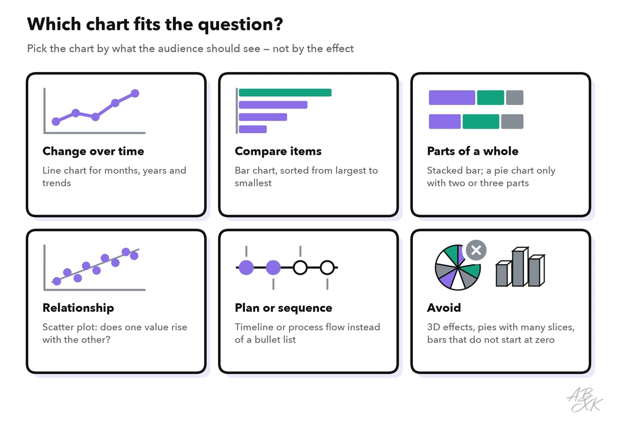
Then check the chart type. A generator may pick a chart that looks impressive instead of one that answers the question. Choose the chart by what the audience should see:
Add speaker notes that sound like you
Slides carry keywords, and you carry the explanation. Speaker notes are the text you add to each slide for yourself. In presenter view, you can read them while the audience sees only the slide. AI is good at a first draft, because it can work from your outline and your notes at the same time:
“Write speaker notes for each slide of the outline below. About 100 words per slide, plain spoken language, only facts from the outline and my notes. End each slide with one sentence that leads to the next slide.”
Then make the notes your own. Read them aloud once with a timer. Cut every sentence you would never say, and replace general examples with real ones from your work. If you run over time, cut slides, not your speaking pace.
Make every slide accessible
An accessible deck works for more people: people with low vision or color blindness, people who use a screen reader (software that reads the screen aloud), and anyone in a bright room with a weak projector. Do not assume that the tool has checked this for you.
The contrast targets in the table below come from the Web Content Accessibility Guidelines (WCAG). They were written for websites, but they are a good standard for slides too (Source: W3C, Web Content Accessibility Guidelines 2.2, 2023, w3.org). The contrast ratio compares the brightness of text and background. It goes from 1:1 (no contrast) to 21:1 (black on white).
| Check | Target | How to fix it |
|---|---|---|
| Text contrast | At least 4.5:1; large text (18 point, or 14 point bold) at least 3:1 | Darken the text or lighten the background; no text on busy photos |
| Chart contrast | Bars, lines and icons at least 3:1 against the background | Use darker colors and thicker lines |
| Color alone | No meaning depends on color only | Label lines and bars directly, add icons or patterns |
| Alt text | Every meaningful picture and chart has a short description | Describe the message, not the shape |
| Slide titles | Every slide has its own title | People who use a screen reader find their way by slide titles |
| Reading order | Text and objects are read out in a logical order | Check and fix the order in your presentation software |
Alt text (short for alternative text) is the description a screen reader reads out instead of a picture. For the example slide above, with its made-up values, good alt text could read: “Bar chart: with the new onboarding, new hires work on their own after 3.5 weeks instead of 6.” AI can draft alt text like this. Give the assistant the chart and its message, then check the result. A model can misread a chart, and alt text with a wrong number misleads exactly the people who cannot see the slide.
PowerPoint has a built-in accessibility checker that finds missing alt text and missing slide titles. Run it, or the matching function in your software, before you share the file.
Where AI slides fail
Most problems in AI decks follow a few patterns. Use this table as your last check before you present:
| Failure | How to spot it | Fix |
|---|---|---|
| Generic text | Titles like “Driving Success Together”, buzzwords, no facts | Action titles with your own facts |
| Text walls | Long bullet lists, full sentences on the slide | Keywords on the slide, the rest in the notes |
| Invented numbers | Values, quotes or sources you never provided | Use only your data, mark gaps with [data needed] |
| Wrong chart | A pie chart for a trend, 3D effects, bars that do not start at zero | Pick the chart by the question |
| Decorative pictures | Images that repeat the title or show nothing specific | Delete them, or use a real photo, screenshot or diagram |
| Broken text in images | Generated pictures with misspelled words or labels | Create pictures without text and add the text yourself |
| Lost story | Every slide looks fine, but the deck has no message | Run the title test again |
The last row matters most. A deck in which every slide looks fine but nothing adds up is a textbook case of what researchers at BetterUp Labs and the Stanford Social Media Lab call workslop: AI output that looks like good work but does not move the task forward. The cost lands on your audience, who must work out what you meant.